Rebuilding the CVS Pharmacy app around refills people actually finish.
A redesign of the CVS Health Pharmacy app centered on two things patients do most: refilling a prescription and knowing where it stands. Replacing a cluttered, hard-to-navigate dashboard with a clear hierarchy drove a meaningful lift in active users after launch.
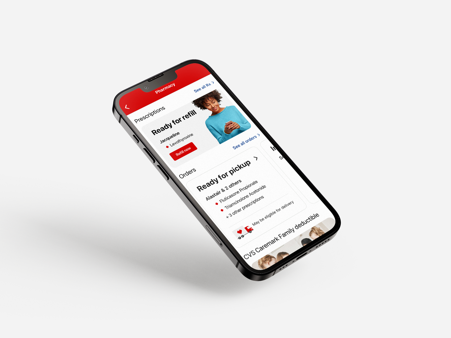
The dashboard went from a wall of options to a clear next step.
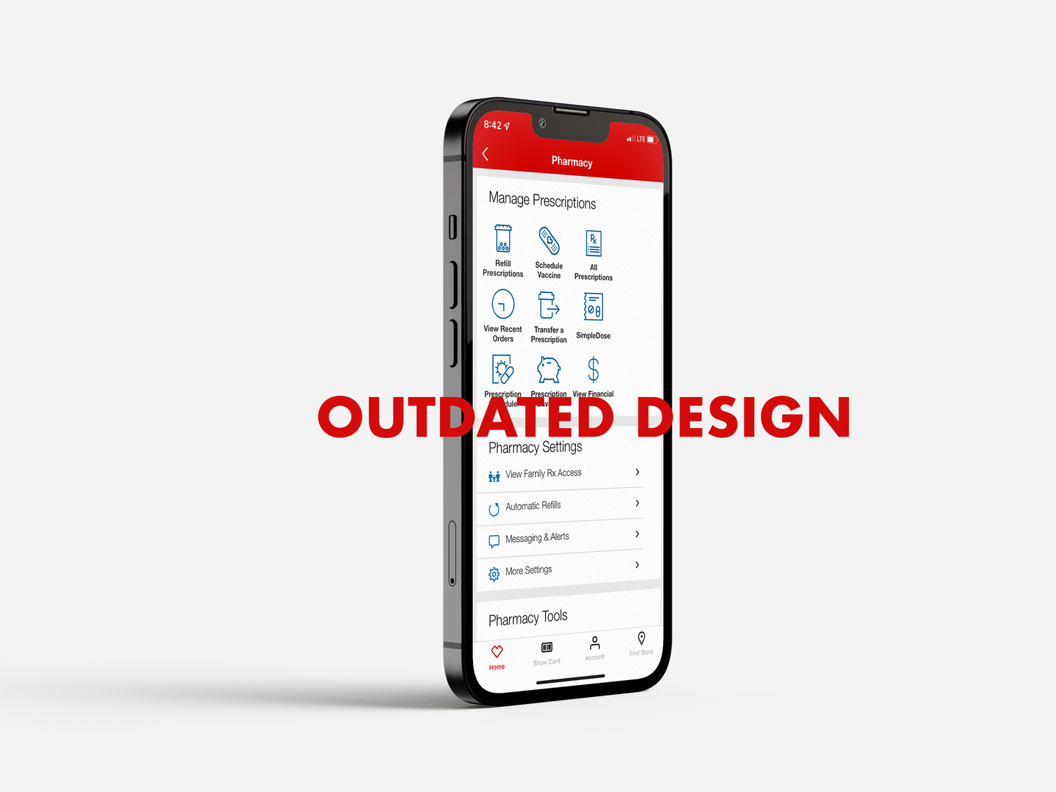
The legacy home screen offered little hierarchy or organization, so every action competed for the same attention. The redesigned dashboard leads with the task a patient is most likely there for, refilling or checking a prescription, and pushes secondary options out of the way.
Refilling a prescription took more work than it should have.
No clear hierarchy on the home screen
Every module competed at the same visual weight, so there was no obvious first move for someone opening the app to refill a prescription or check on an order.
Order status buried below the fold
Patients waiting on a refill had no quick way to see where it stood, pushing them toward calling the pharmacy instead of checking the app.
Low return usage
Without a clear, repeatable path for refills, patients had little reason to come back to the app between pickups.
Design around the two jobs patients actually come to do.
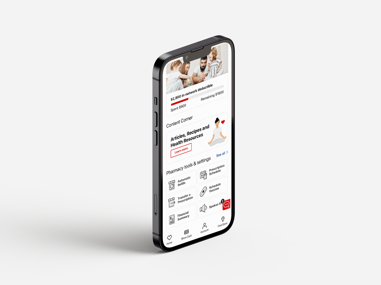
The redesign organized the app around two consistent, repeatable paths: an easy refill flow and clear visibility into order status, starting from sign-in through the dashboard. Reducing everything else to a supporting role gave the two highest-frequency actions room to be fast and obvious.

An overview of the redesign.
| Element | Before | After |
|---|---|---|
| Hierarchy | Flat layout, every module competing for equal attention | Clear priority given to refills and order status as top actions |
| Order status | Buried below other content, hard to find at a glance | Surfaced on the dashboard with clear, scannable status |
| Refill flow | Multiple steps with no consistent entry point | A single, repeatable path from sign-in to refill |
| Engagement | Infrequent return visits between pickups | Significant increase in active users since launch |
A clearer hierarchy turned into a real lift in engagement.
The redesign wasn't about adding features, it was about deciding what mattered most on a screen a patient might open under stress, waiting on a medication. Giving refills and order status a clear, consistent home made the app worth opening again, and usage followed.